This functionality allows to analyse the biological data from the Instituto Español de Oceanografía oceanographic surveys stored in the SIRENO database, It is possible to calculate biological indeces such as abundance. In addition, it facilitates to compare this information with the available data in OBIS and FAO. Also is possible link this biological information with oceanographic information provided by the NOAA/OAR/ESRL PSD, Boulder, Colorado, USA, from their Web site at http://www.esrl.noaa.gov/psd/
When the user starts this functionality, in the map region the "Select Samples" panel is showed.
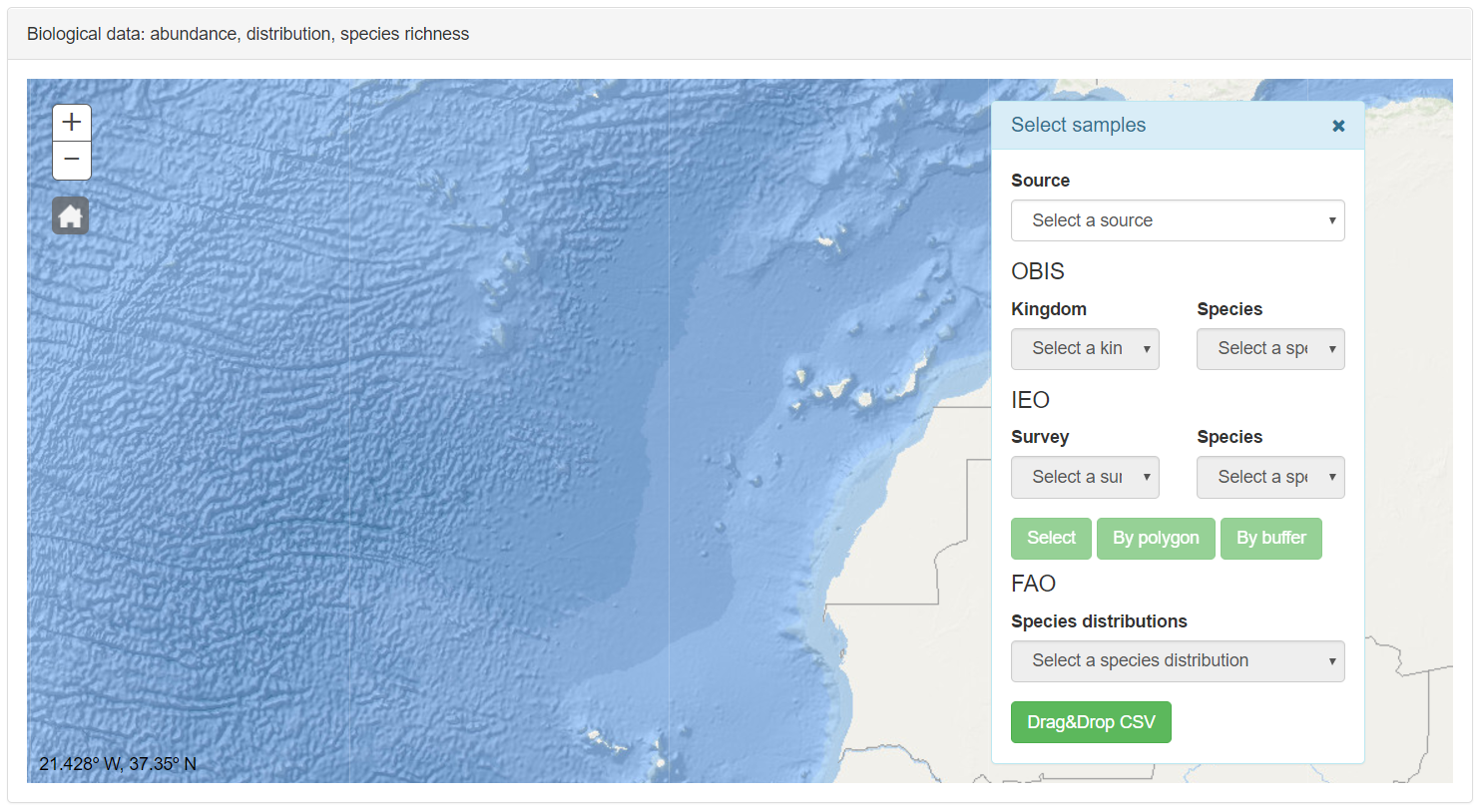
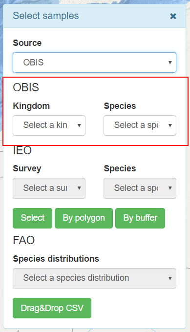
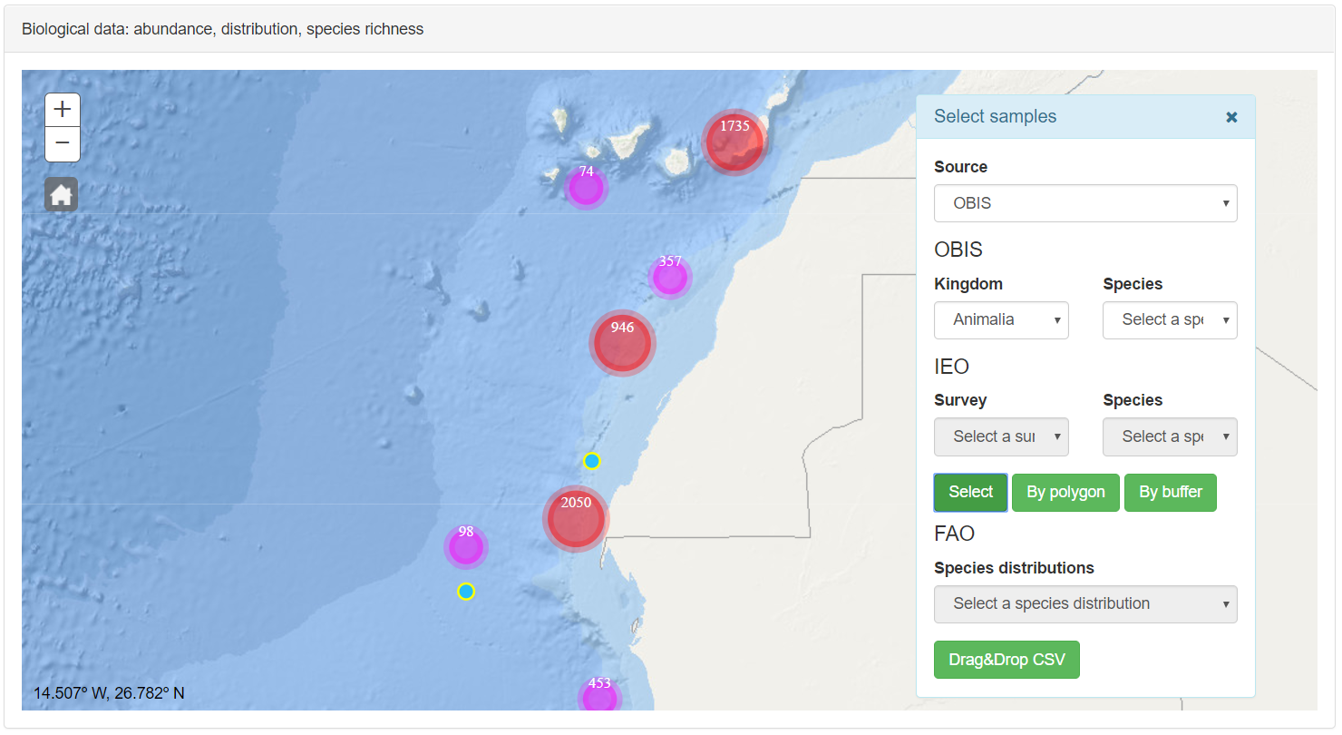
This panel has several selectors from which the user can choose the information that is loaded in the map. With the Source selector the data source is selected. The options are IEO, in order to select the samples taken by the Instituto Español de Oceanografía in the region. The OBIS option allows accessing to the open source data available in the OBIS web page. FAO species distributions selector allow load the vectorial information about distribution available throught the WMS published by FAO. The IEO-OBIS-FAO option allow the visualization of all datasets.
Once that a dataset is selected, the other selectors of the corresponding dataset are available. In the IEO section, inside the Select Sample panel, two selectors allow filter by survey and by species.
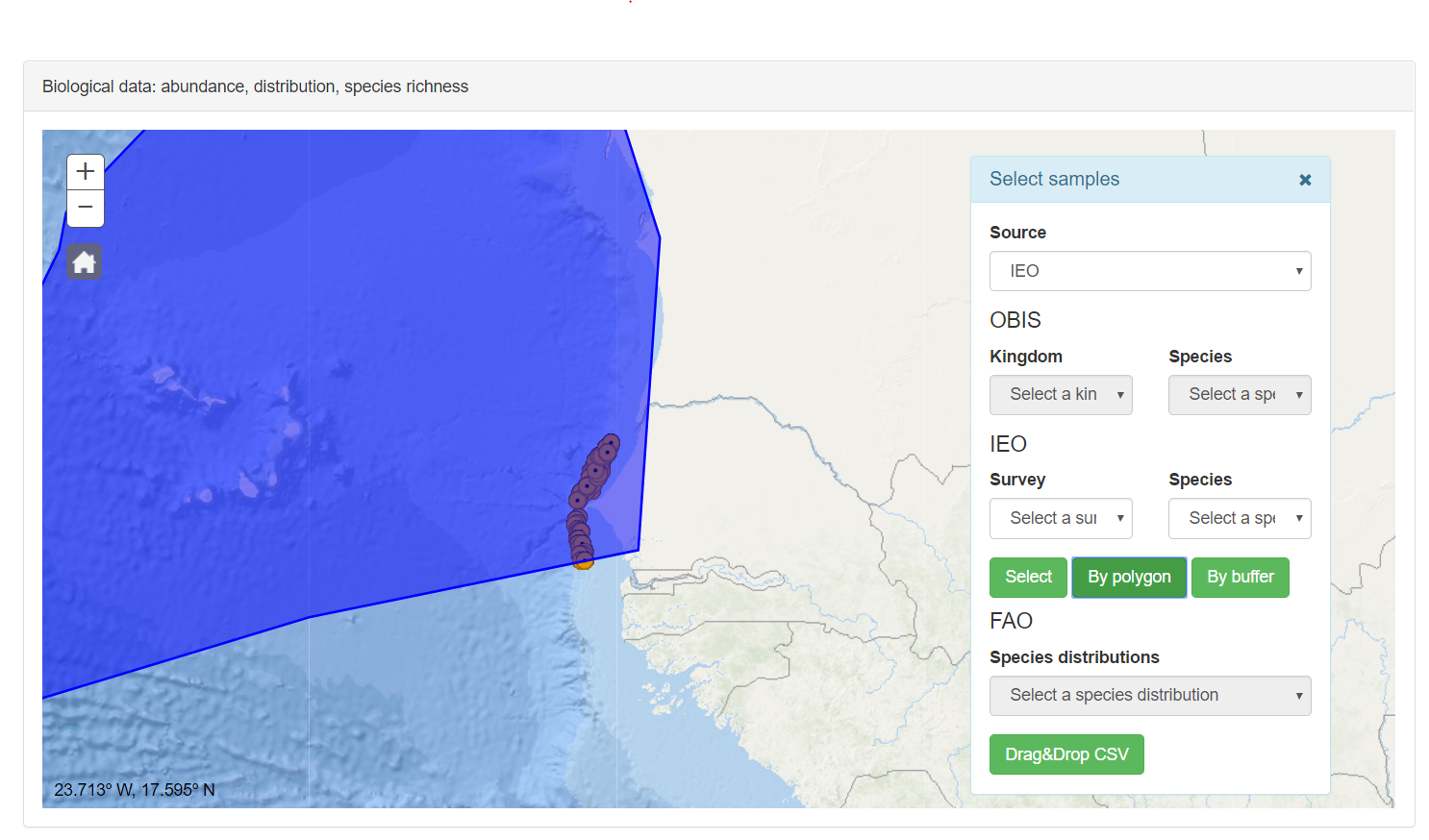
Click on select button to send a Ajax call to the server and the corresponding geoprocessing service will return the information in a JSON format. This response is loaded as a point layer in the map, doing center and zoom over this result. In the next case, the survey with acronym IBN_ SINA8104is selected. The Species selector is not filled; in this case, by default all available samples of this survey are selected. If any survey is selected in the Survey selector all surveys are used in the filter.
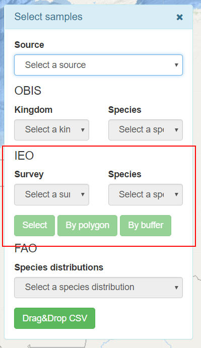
At the same time the symbol panel is showed in order to select a style for the layer loaded. The use of the symbology tool will be described later.
Automatically below the map a graph with the biological index (if this info is available) is added. The user can do new selections and a new graph is added below the map, in this way it is possible to compare the results of each consult. For example is possible compare one survey over another.
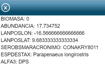
When the user click over one entity a popup is displayed.
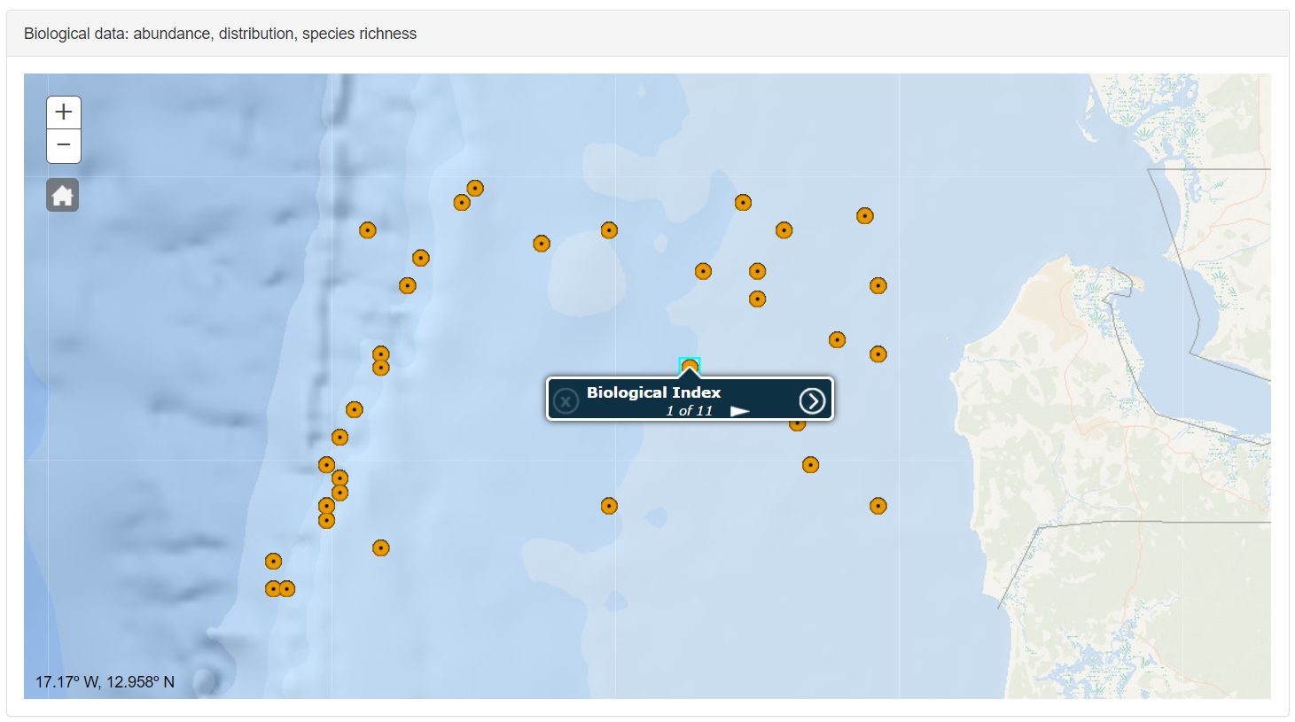
Click over the arrow button
 to show the metadata information of the selected sample
By Poligon button allow to the user draw a polygon over the map. Click with the left mouse button to add vertices and double click to finish. Once time finish the polygon the geometry is send to the corresponding geoprocessing service as a spatial filter. The result of this query are the entities that are inside of the polygon and satisfying the value requirements selected by the user.
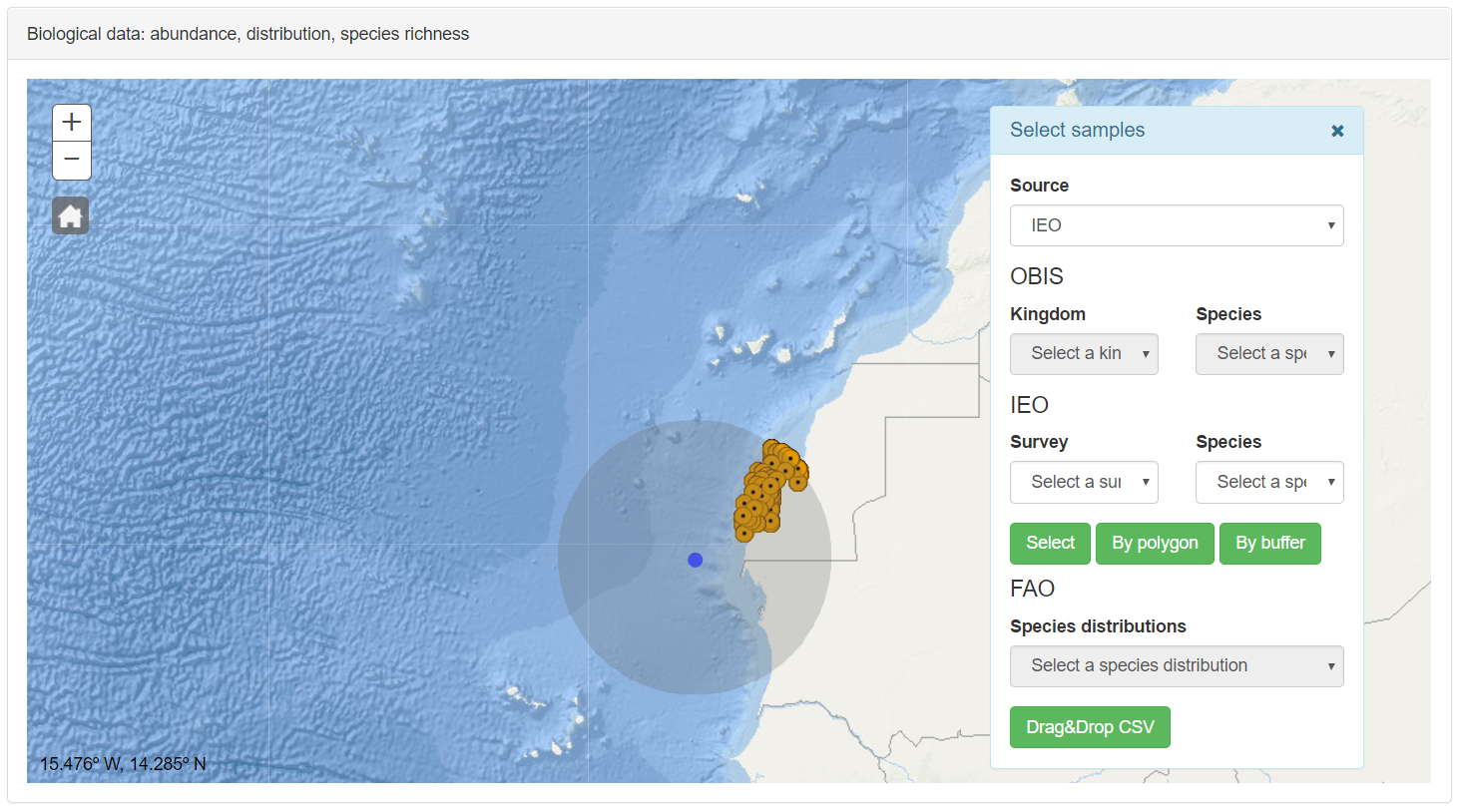
By Buffer button allows to generate an area as spatial filter. When the user clicks over this button the Geodesic Panel is displayed, this panel was described in Main Tools section. The user can generate an influence area and the resulting polygon is used as a spatial filter in the corresponding geoprocessing service. The result of this service is returned as a POST Ajax call in JSON format. This result is loaded as a point layer in the map.
In the OBIS section inside the Select Sample panel, the user find two selectors that allow filter by family and by species.
As in the previous case, with the button Select, By Poligon and By Buffer, the app send the filter parameters (spatial or attribute) to the geoprocesing service, this service returns the result in a JSON format. The result is loaded in the map as a point layer. Due to the large number of entities returned this layer in the most of the cases is clusterized, and for reasons of operation only are showed the first 10000 records.
When user click over an entity a popup is displayed. With the arrow button, the metadata of this sample is shown.

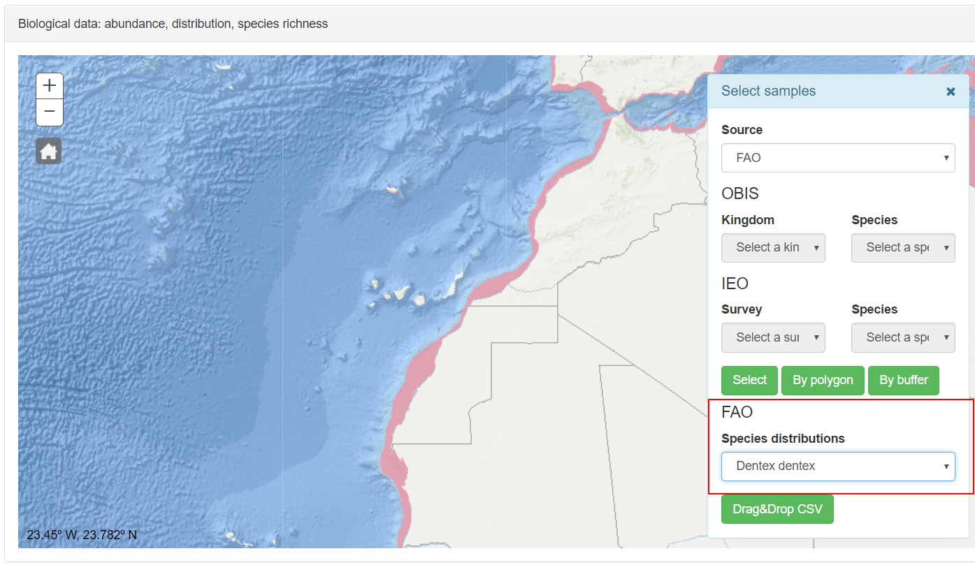
In the FAO section, the user can select the species to show the distribution area for the species selected.
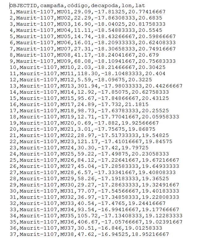
This funcionality allow drag and drop CSV files over the map. In order to load the user´s data in the app, the information must be stored in a text file with a CSV format CSV (Coma Separated Value). The head of the file correspond to the name of each column. In this file must exist two fields, one of them called lon and the other lat. In both fields the position is stored. The lon field correspond to the longitude and the lat field to the latitude, both in the WGS84 (EPGS:4326) reference system and in decimal degrees using the coma as decimal separator. Only these fields are required, the rest of the fields correspond with the information that the user wants to analyse.
Here is an example about the csv format ready to be uploaded by the application.
To load the file in the app the user only needs to drag and drop the file over the map and automatically a layer of points is displayed with the samples position of the CSV file.
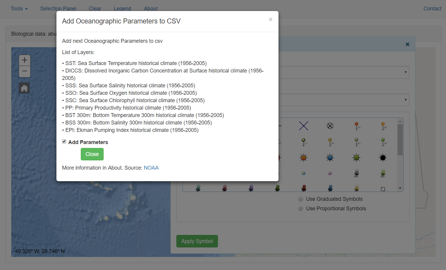
At the same time a panel allow load oceanographic data in the CSV table (Source: NOAA)
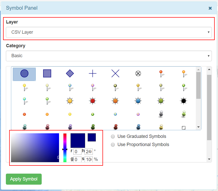
The symbol panel is showed to select the suitable symbology.
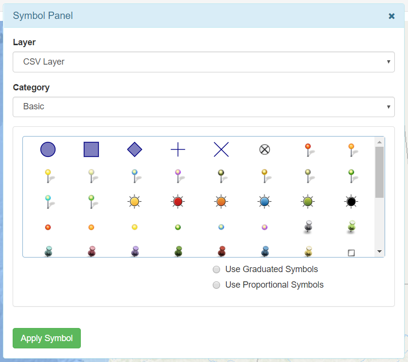
In the Category selector different kind of symbols are accessible. Once time a symbol is selected (click over the symbol), it is possible select the color.
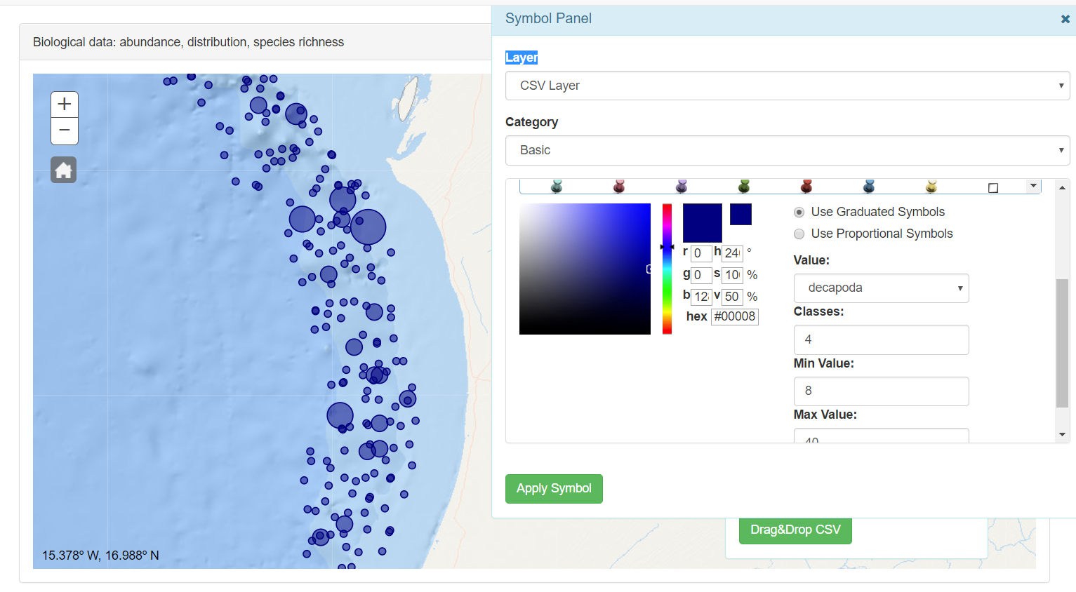
Graduated symbols are used to show a quantitative difference between mapped features by varying the size of symbols. Data is classified into ranges that are each then assigned a symbol size to represent the range. For instance, if your classification scheme has five classes, five different symbol sizes are assigned. The color of the symbols stays the same.
Symbol size is an effective way to represent differences in magnitude of a phenomenon because larger symbols are naturally associated with meaning a greater amount of something. Using graduated symbols gives you a good degree of control over the size of each symbol, because they are not related directly to data values as they are with proportional symbols. This means you can design a set of symbols that have sufficient variation in the size that represents each class of data to make them distinguishable from one another.
In the value selector the field to symbolize is selected. In the classes input the user can write the number of classes to distinguish. With the min value and max value the user can select the min and max value in pixels of the symbol
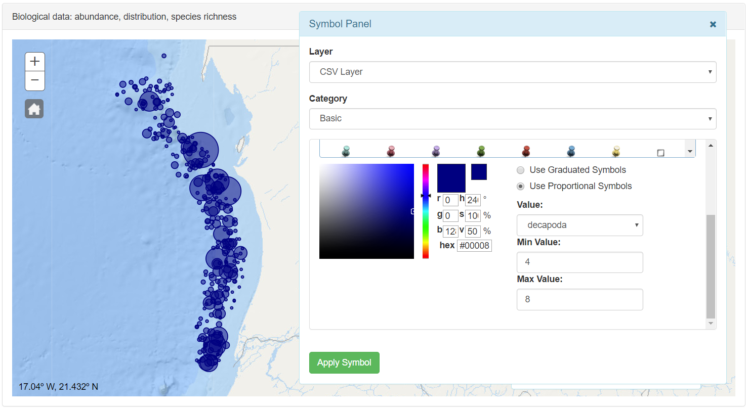
Proportional symbology is used to show relative differences in quantities among features. Proportional symbology is similar to graduated symbols symbology in that both draw symbols sized relative to the magnitude of a feature attribute. But where graduated symbols distribute features into distinct classes, proportional symbols represent quantitative values as a series of unclassed symbols, sized according to each specific value.
In the value selector the field to symbolize is selected. With the min value and max value the user can select the min and max value in pixels of the symbol
In the Biological Data funcionality also are available Geodesic, Print Map and Export CSV tools, already described in the main page.